Boski: Onboarding for a Personal AI Agent
I went through Boski’s onboarding as a new user, found where it loses trust, and rebuilt the flow as a clickable iOS prototype in code.
Client
Boski
Deliverables
Onboarding audit
iOS prototype in code
Motion, sound and haptics

I signed up for Boski. Here’s the onboarding I’d ship.
Same steps and the same swipe cards, with three fixes: trust, answers that come back, and value before the paywall.
01 The brief
Fix their problem, not a generic redesign.
Boski is a personal AI agent that lives in iMessage and an iOS app, and launched publicly in September 2026. The team asked me for a proposal: what could be shipped quickly, on their product, that shows real value and taste.
Their stated priority was onboarding: gathering enough context about a person, before they start, for the agent to be useful from day one. So I went through the real flow on my iPhone, recorded it, and rebuilt it in their stack. The audit, the benchmark, the visual direction, the prototype and the code are all mine.
Category
Consumer AI agent
A personal agent on iMessage and iOS, where the first minutes decide whether it gets trusted.
Scope
Audit to prototype
A walkthrough, a benchmark of 11 AI onboardings, a visual direction and six screens in code.
Platform
iOS, built for the web
Next.js, React and motion, written to port to SwiftUI.
Timeline
Two days
From my first run through the onboarding to a link the team passed on.

Six screens, in motion
Vibe, lookup, facts, profile, goal and first step, recorded from the clickable prototype.
02 What I found
Three minutes, 25 taps, and nothing for you before the paywall.
The flow from sign-in to paywall took 3:13 on my recording. Boski already knew a lot about me but never said how, so the facts read as “how do you know this?” instead of “it gets me”. Four slider answers were collected and never came back. The paywall arrived before Boski had done anything for me.
The strongest moment they already had was the “Do I have this right?” cards: the idea was right, it was missing transparency. Separately, I handed the developers five bugs and quick wins, including a session that was lost when switching to Messages for the SMS code.
03 Trust first
Say where facts come from before asking if they are right.
The obvious fix was better-looking cards. I added a screen instead: a four-second lookup that names where Boski looked (LinkedIn, portfolio, Instagram) and says nothing is saved until you confirm it. Then the sources fold into the stack you are about to check.
Each card swipes to a ME or NOT ME stamp. Confirmed facts fly into a mini profile, rejected ones dissolve, and undo is always there. Next to Meta Muse, and to Instinct, which was criticised for privacy, transparency is the one advantage a budget cannot buy.

A new screen: where Boski looked
Today you land straight on cards about yourself. Now a four-second lookup names the sources first, and says nothing is saved until you confirm it.
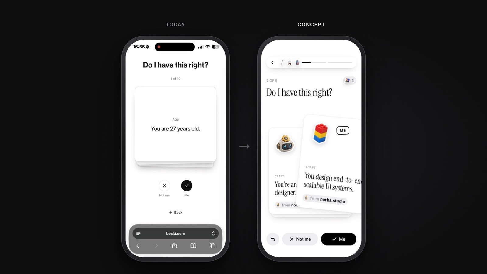
Every fact says where it came from
Today the first card is your age, with no source. Now each card carries a sticker, a category and its source, and age is gone.
04 Answers that come back
If you ask, show the answer again.
Four identical slider screens became one stack of four cards. Objects at both ends react as you drag, five snap points tick with haptics, and the middle is a valid answer too: Analytical and Intuitive.
Your vibe flies into the progress bar and returns on the profile, where your name assembles from particles and confirmed facts drop in as stickers with real physics. Drag one, throw one, tap it to see its source or remove it.

A slider that means something
Today: four identical slider screens whose answers never come back. Now objects react as you drag, five snap points tick with haptics, and the middle is an answer too.

Nice to meet you, for real
Today the summary is a list of text badges and the slider answers are missing. Now you can throw what Boski knows about you, and your vibe comes back underneath.
05 Value before the paywall
Boski should do something for you before it asks for money.
Goals now match the landing page, on a glass picker that bends what passes under it, with a suggestion backed by a fact you confirmed. A “This week with Boski” thread previews what the agent would actually do.
Then a first step in the style of the landing page, with the work already done: “Land your first client. Send the pitch I drafted.” You slide to commit, Boski says when it will check in, and only then does the paywall appear, continuing the same card with the same plan name and currency as checkout.

Goals that match the promise
Today: four black buttons, with different goals than the landing page. Now one glass picker, a suggestion backed by a fact you confirmed, and a preview of Boski’s week.

Value before the paywall
Today the paywall follows the goal picker. Now Boski hands you a first step with the pitch already drafted, and the paywall continues that card.
06 How it is built
AI-native speed, with every decision written down.
I built it with Claude Code in Next.js, React and motion, Boski’s own web stack, and wrote it to port to SwiftUI: springs map to .smooth and .bouncy, the number drum to numeric text transitions, the stepper to matched geometry. Performance was a design decision: a light 2D canvas for the particle name instead of WebGL, and refraction only inside the small lens, so it holds 60 fps in Safari on an iPhone. Sound is synthesised in one key, so the three checkmarks in the lookup make a chord. About 90 decisions are logged, each with one sentence of why.
3:13
Minutes from sign-in to paywall, today
~25
Taps and swipes in the current flow
0
Moments of value before paying, today
11
AI and personalisation onboardings benchmarked
6
Screens rebuilt in code, with motion and sound
~90
Design decisions logged, each with a reason
5
Bugs and quick wins handed to the developers
2 days
From the first walkthrough to a shareable prototype
The facts were never the problem. Not knowing where they came from was.
07 Outcome and next
Asked to click through it again, then passed on.
On the call, the first request was to go through the prototype again from the start. The prototype and a short before-and-after note were then passed on to product, engineering and content. The prototype is deterministic, with no backend, so every screen behaves the same way in every review.
What I would measure next: completion per screen, the share of NOT ME per fact as a data-quality signal, time to paywall, and paywall conversion before and after the first step. What I would do differently: test the lookup screen with five new users before building physics into the profile. Trust is the hypothesis, the stickers are the reward.
Next project