BORD: Learning Platform for Enterprise Training
A modular course builder and learner experience with quizzes, progress tracking, and a marketplace for pre-made training content.
Client
Confidential Client
DELIVERABLES
Product Strategy Support UX/UI Design Information Architecture Interaction Design Prototyping
Year
2026
Role
Product Designer

Context
BORD targets organizations where training is frequent, mandatory, and requires visibilityl often across multiple teams, job roles, and compliance needs.
The key challenge wasn’t only “build a course builder.” It was designing an end-to-end system where:
admins can create and manage content quickly,
learners can progress smoothly (including quizzes and feedback),
organizations can scale content through a marketplace and subscriptions.
The problem
Enterprise training repeatedly breaks in the same places:
High setup friction: creating a course structure takes time and coordination.
Low completion rates: learner experiences are often boring, unclear, or lack progress visibility.
No feedback loop: quizzes exist, but results don’t translate into actionable improvement.
Scaling content is hard: organizations don’t want to build every course from scratch.
Fragmented admin workflows: dashboards, subscriptions, teams, and catalog management often feel like separate tools.
Success criteria and North Star
When reliable post-launch metrics weren’t available, success was defined through observable adoption and workflow completion.
North Star: Time to first learning value — time from creating/selecting a course to the moment learners start progressing (and admins can see it).
Leading indicators:
Admin: course creation completed, modules/lessons added, assessments created, courses published
Learner: onboarding completion, lessons started, quizzes completed, progress milestones reached
Org: marketplace subscriptions completed, courses assigned, monthly completions increasing
Design principles
Time-to-first-value: get admins from “empty state” to a publishable course fast.
Clarity over complexity: structured content creation and simple progress visuals.
Feedback drives improvement: quizzes and results should tell users what to do next.
Scale through reuse: marketplace and subscriptions reduce repeated work.
Consistency across surfaces: admin and learner experiences should feel like one product.
The story
Chapter 1 - Admin Experience: Course Creation + Marketplace + Subscriptions
Goal
Enable admins to build and manage training at scale: create courses from scratch, structure content (modules/lessons/assessments), publish, and expand catalogs via marketplace subscriptions.
What I designed
Course creation flow
Entry decision: Create with AI vs Start from scratch
Start-from-scratch modal: organization, title, thumbnail → continue to builder
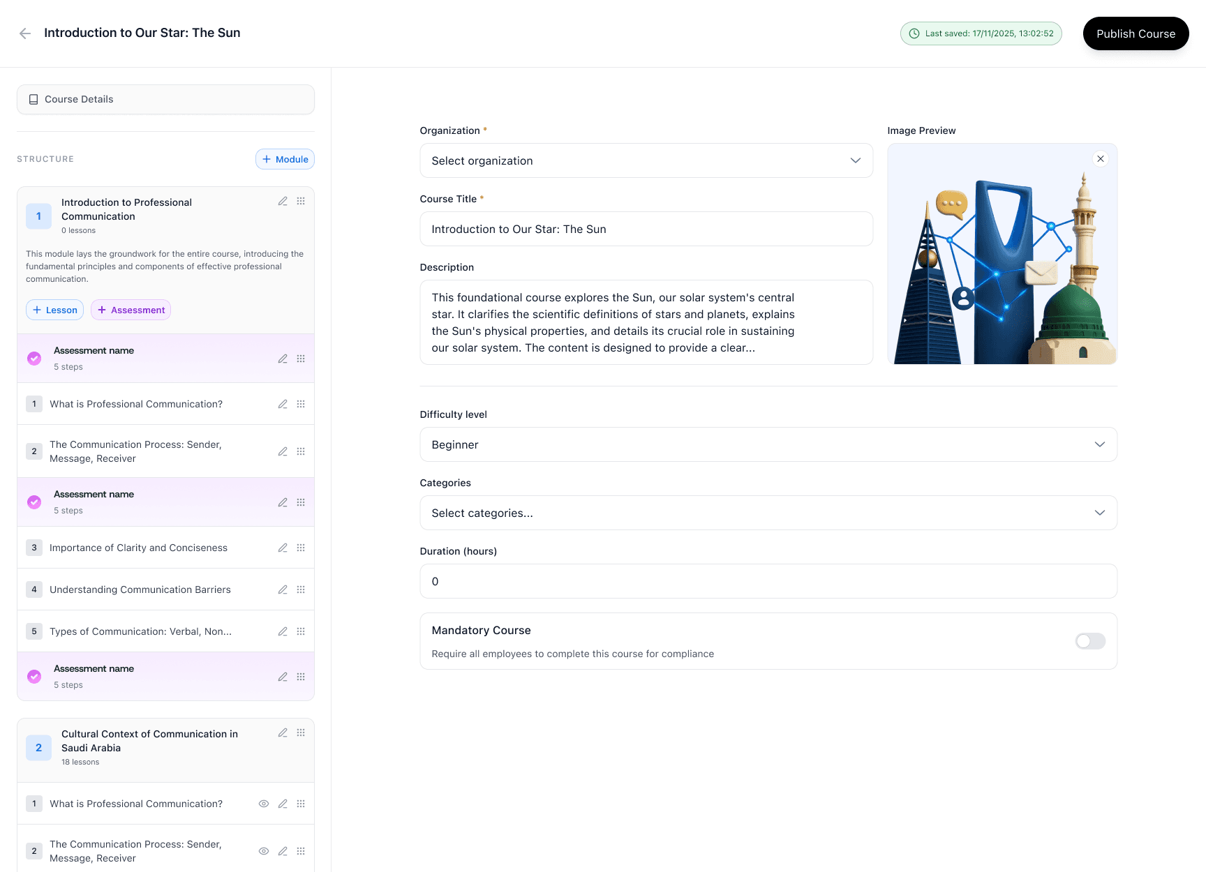
Course details surface: description, difficulty, categories, duration, mandatory toggle
Content structure: modules → lessons and assessments
Assessment steps: single choice, multiple choice, true/false
Publishing CTA with save state feedback
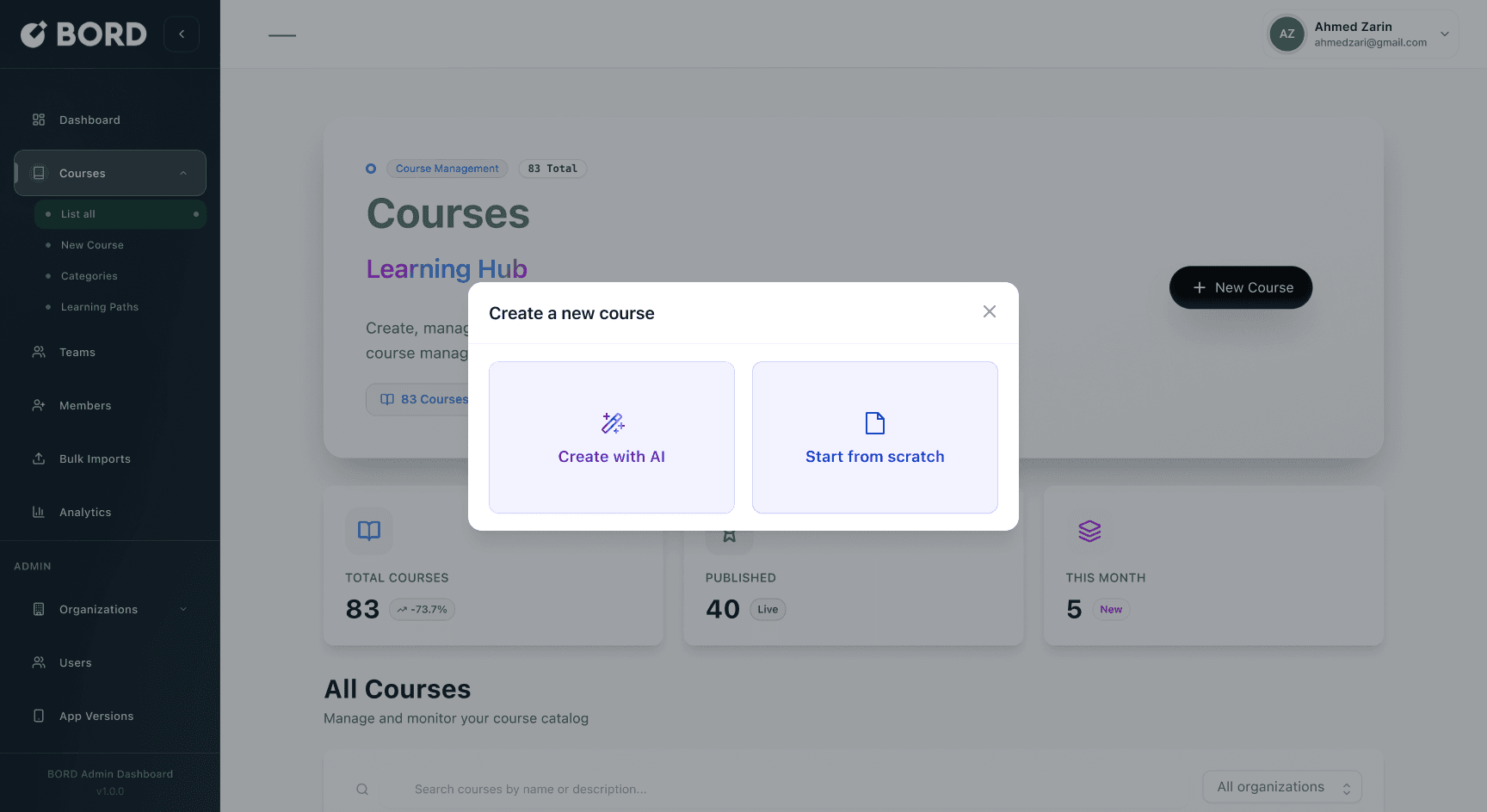
Create new course modal (Create with AI vs Start from scratch)
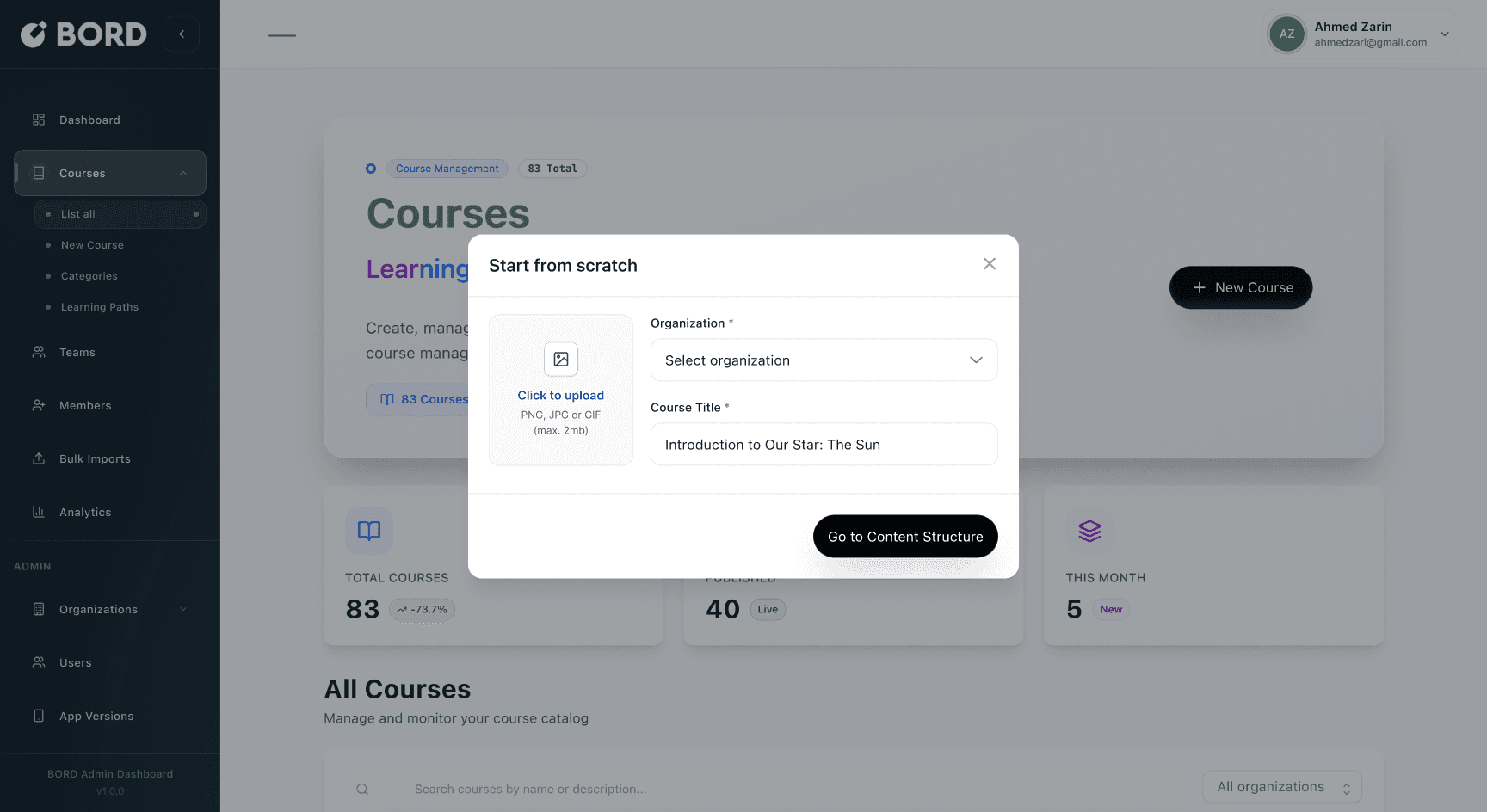
Start from scratch modal (Org + Title + Upload)
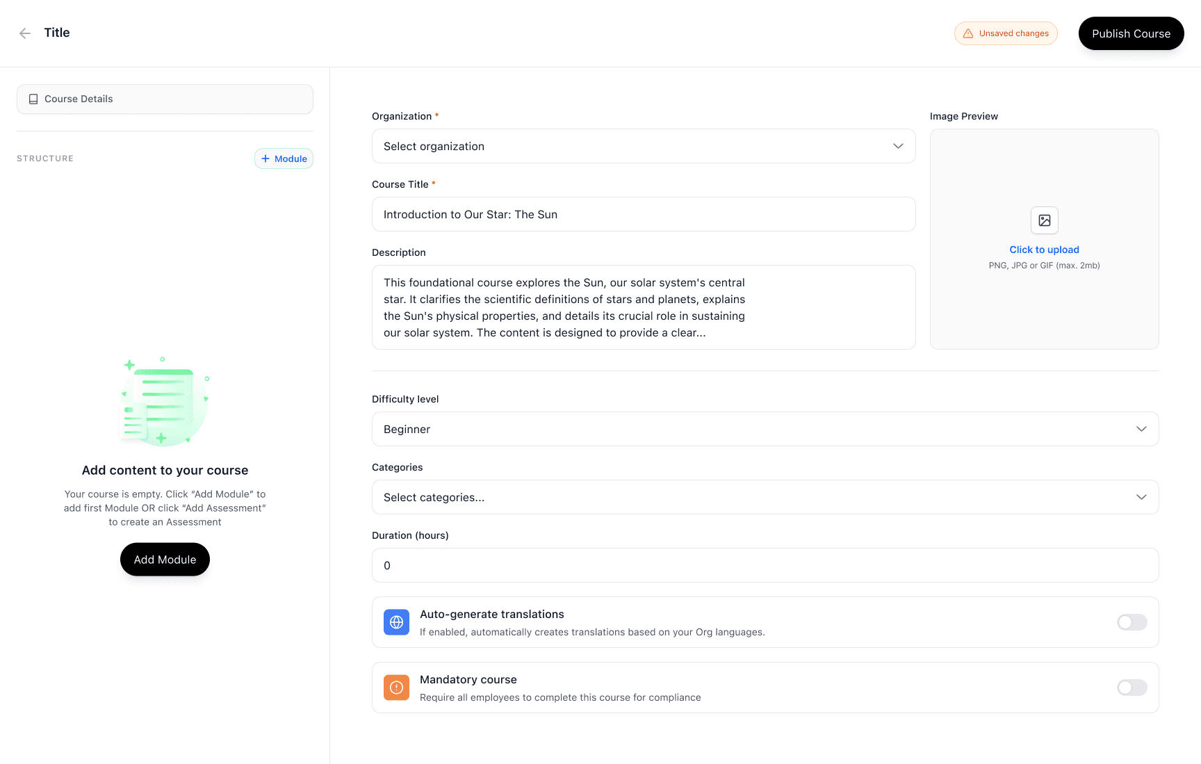
Course details form (Description, difficulty, categories, duration, mandatory)
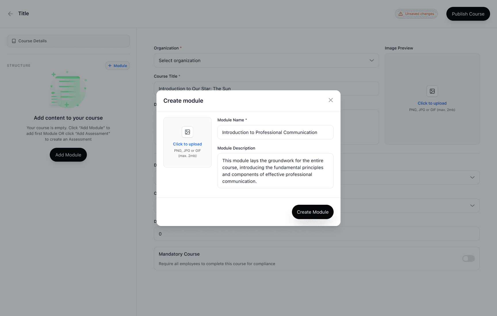
Create module modal
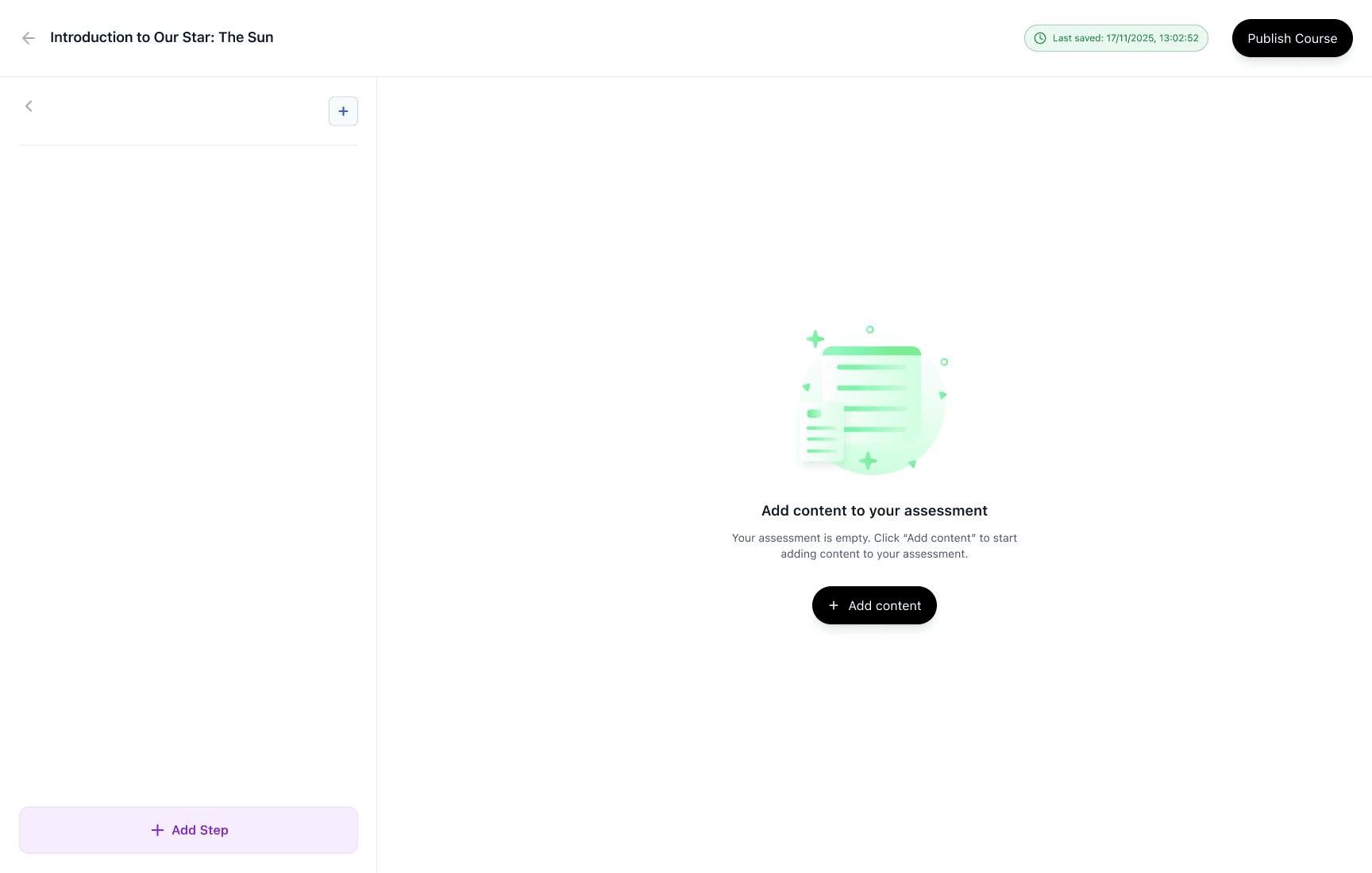
Add content to your assessment
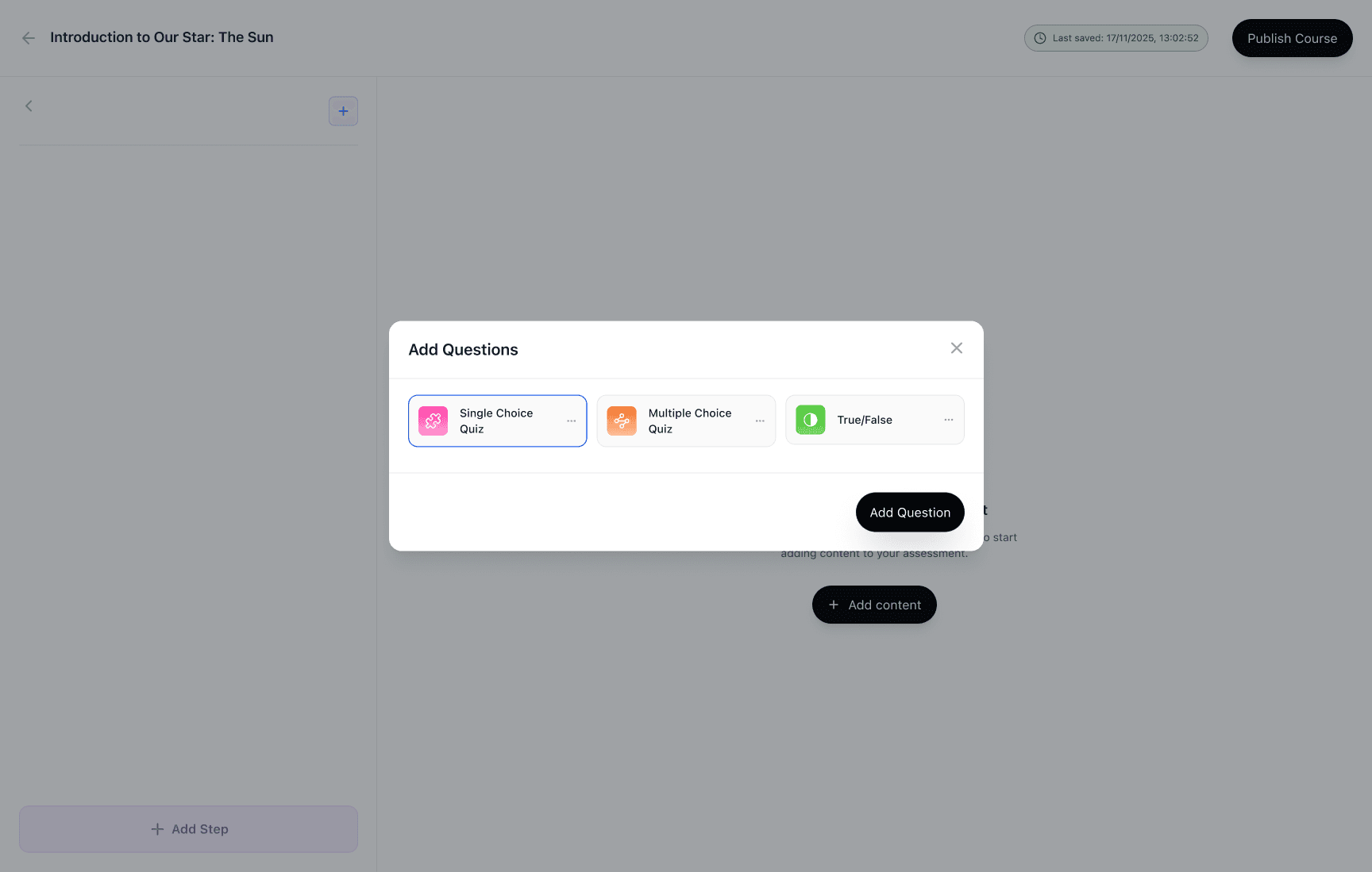
Add questions modal (Single choice / Multiple choice / True-False)
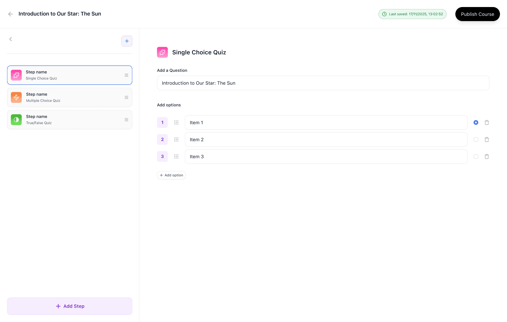
Assessment builder — Single choice question (options + correct answer)
Course details + Structure populated (modules + lessons + assessments)
Marketplace flow
Marketplace catalog with search, industry filter, and sorting
Course preview modal with learning objectives + audience + modules count
Subscribe flow: subscription summary → payment → confirmation
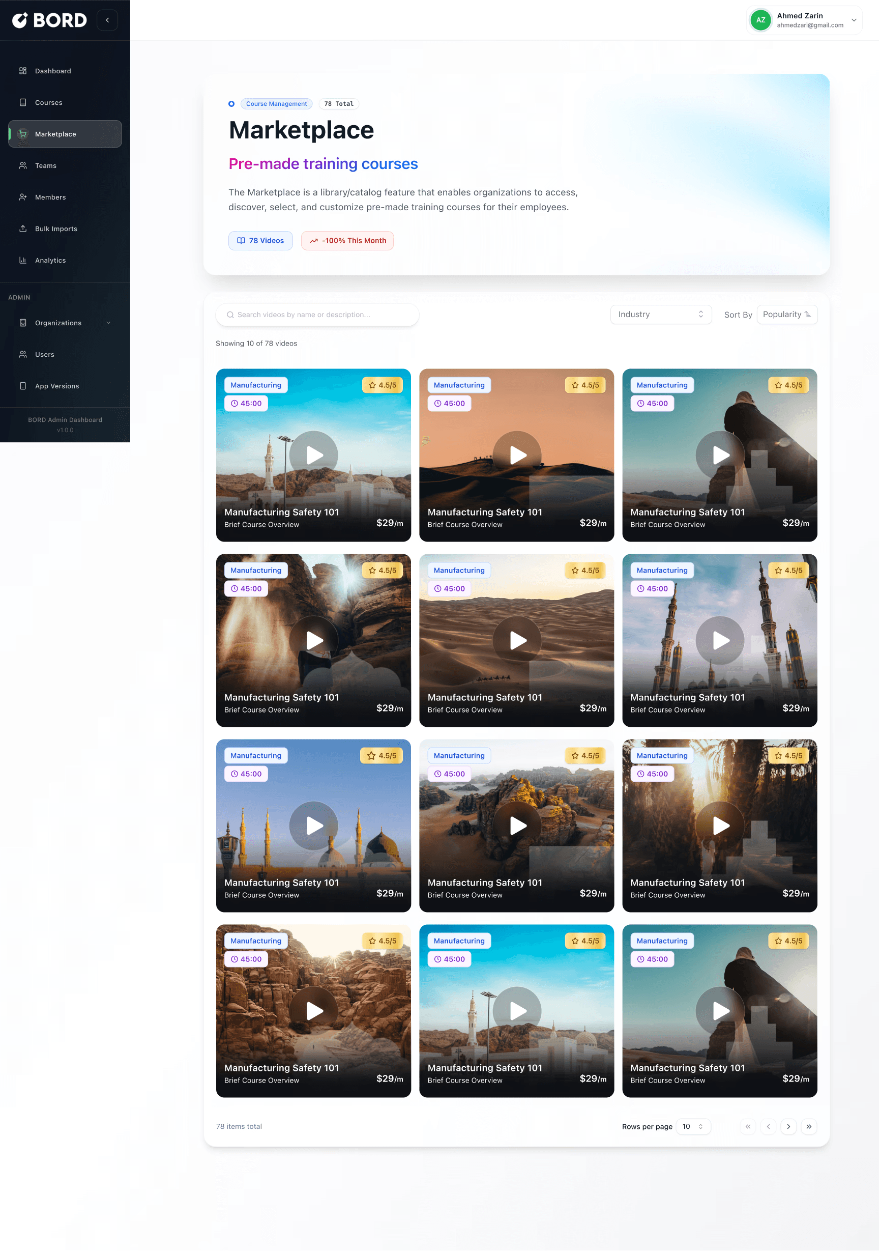
Marketplace grid (search + filter)
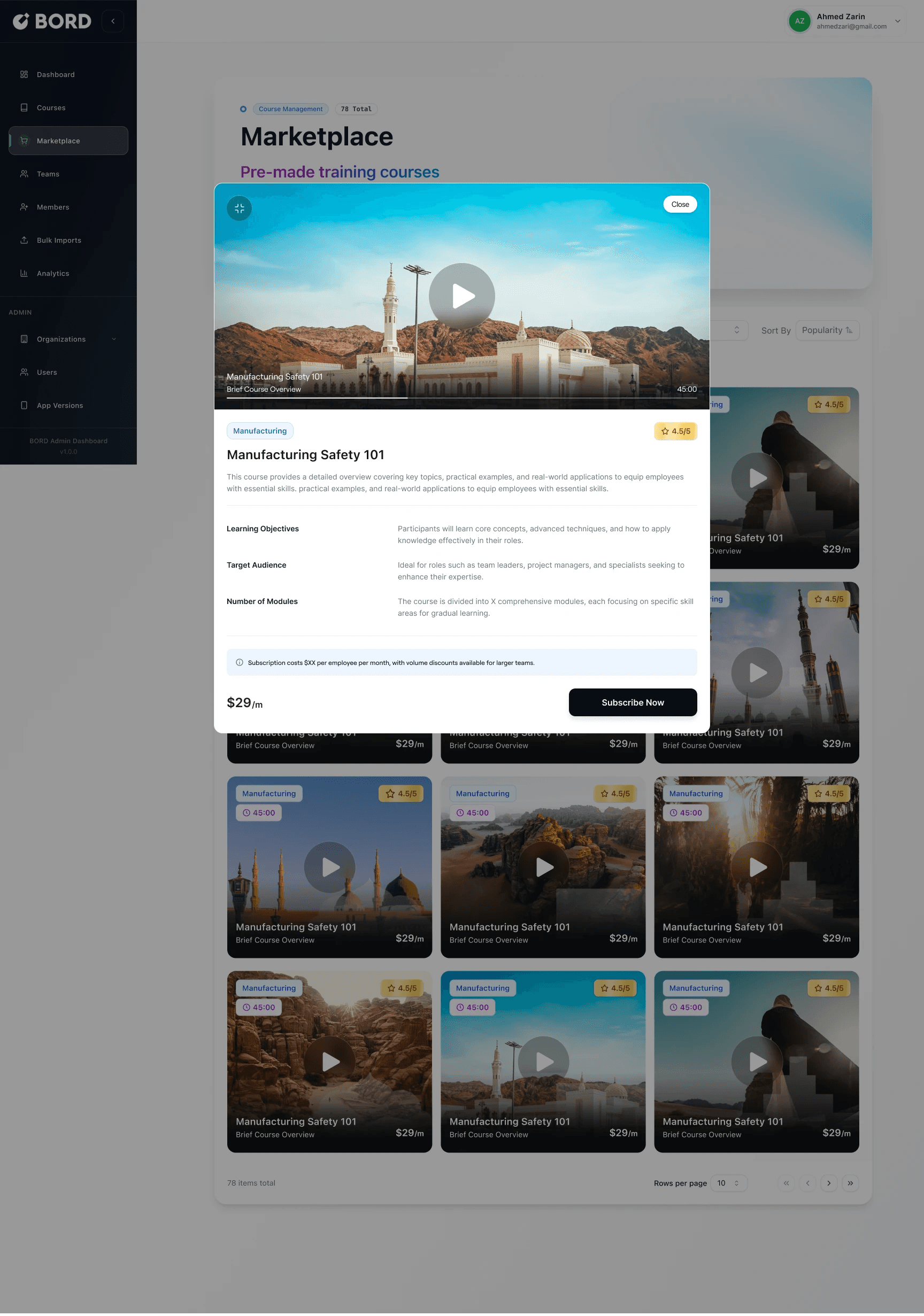
Course preview modal (with video hero)
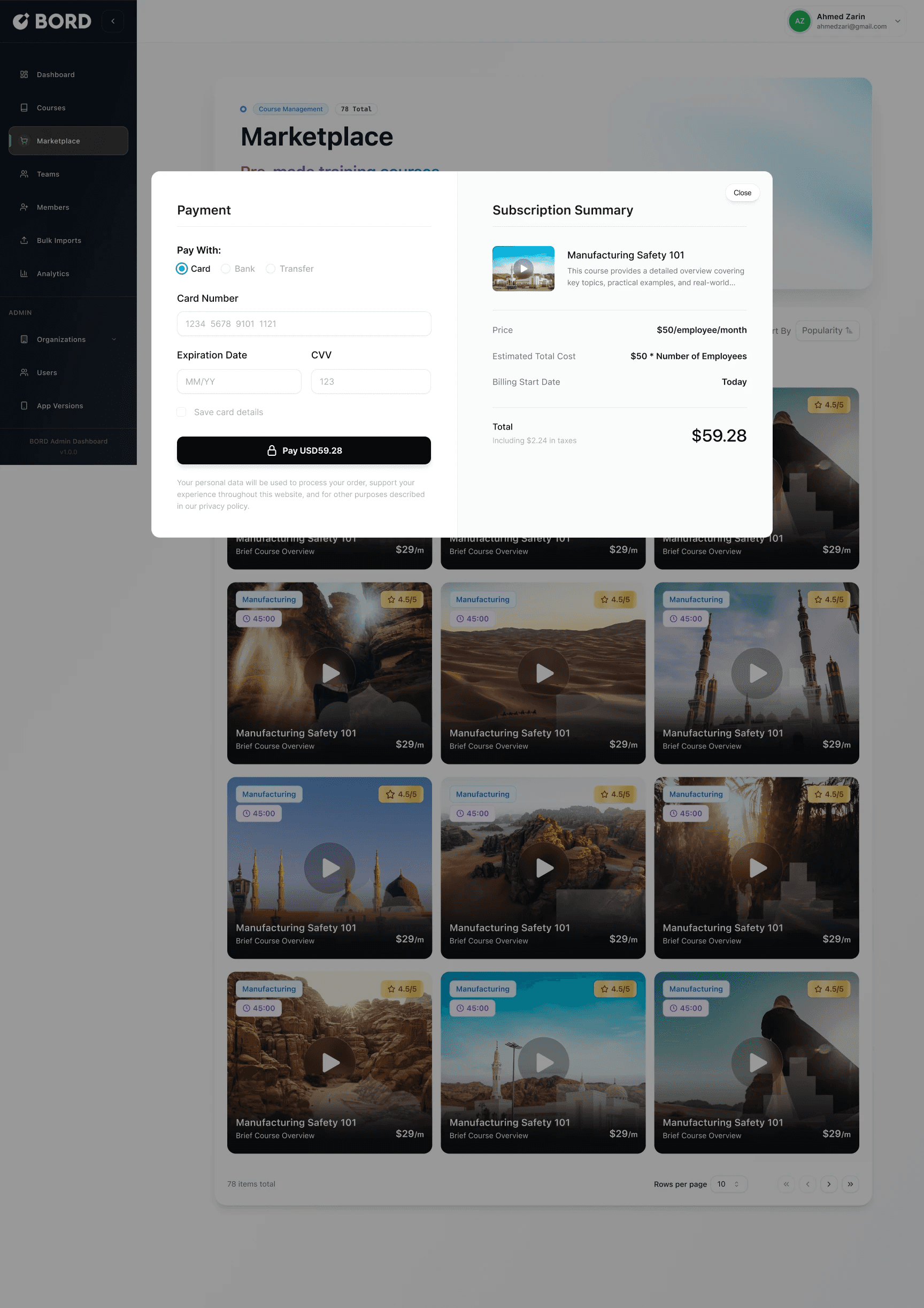
Payment + subscription summary modal
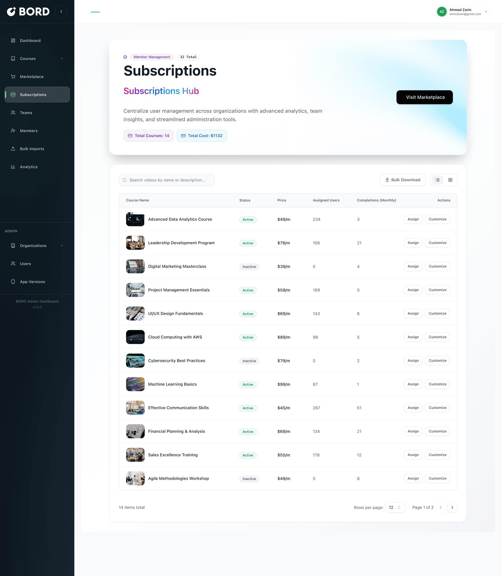
Subscriptions management
List of subscribed courses with status, price, assigned users, monthly completions
Admin actions: assign, customize, bulk download
Payment + subscription summary modal
Why this matters
Admins adopt systems that reduce admin burden and provide clear outcomes:
fast course setup via structured content blocks
scalable content acquisition through marketplace subscriptions
centralized view of what’s active, assigned, and completing
We designed the admin experience as a single, continuous workflow: create a course, structure it into modules and lessons, add assessments, publish, and then scale the catalog through marketplace subscriptions.
Course creation starts with a simple choice—Create with AI or Start from scratch—to support both fast generation and full control. The builder focuses on structured inputs (course details + content hierarchy) to avoid long, unstructured forms. Empty states guide users toward the next step (“Add module”, “Create a lesson”), while save state feedback and a clear Publish action reduce uncertainty.
For assessments, admins can add different question types (single choice, multiple choice, true/false) using a consistent pattern: select question type → add question → define options → set the correct answer.
To reduce repeated work and support larger organizations, the Marketplace enables teams to discover pre-made courses by industry and subscribe instantly. The subscription flow is intentionally simple—preview → summary → payment—while Subscriptions management provides a centralized view of cost, assignment, and monthly completions.
Chapter 2 - Learning Journey: Lessons, Progress, Quizzes, Results
Goal
Make learning measurable and motivating by pairing progress tracking with quizzes that provide clear feedback and a reason to continue.
What I designed
Course creation flow
Progress rate displayed across course and dashboard surfaces
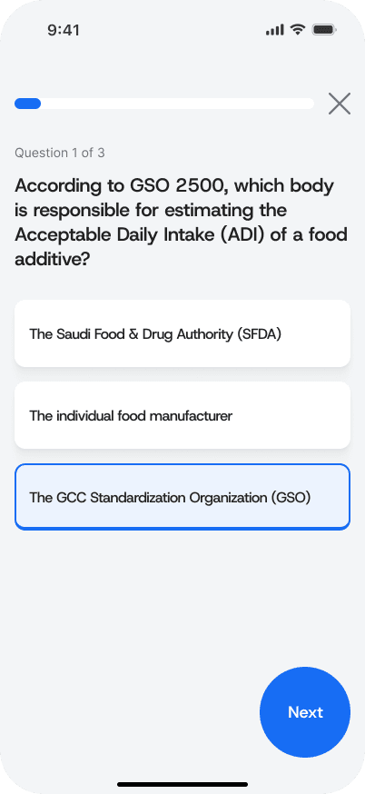
Quiz experience with clear question states and selection feedback
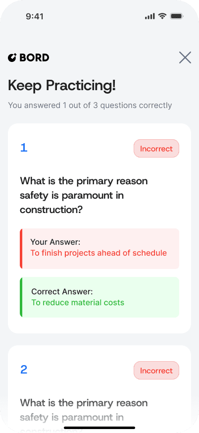
Results screens for both success and failure
Review mode that shows incorrect answers + correct answers + why it matters
First-time quiz onboarding carousel to explain the scoring system
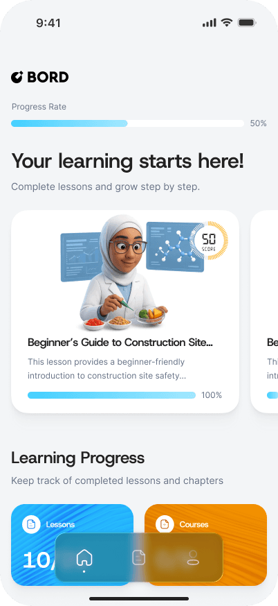
Learner dashboard with progress rate and course card
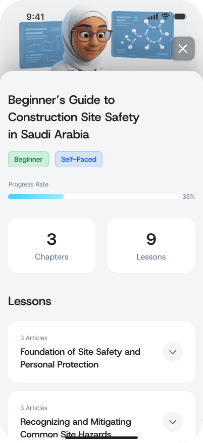
Course screen with progress rate and lesson list
Quiz question screen
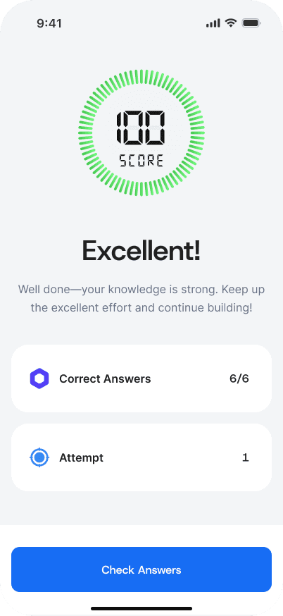
Score result screen (high score)
Score result screen (low score)
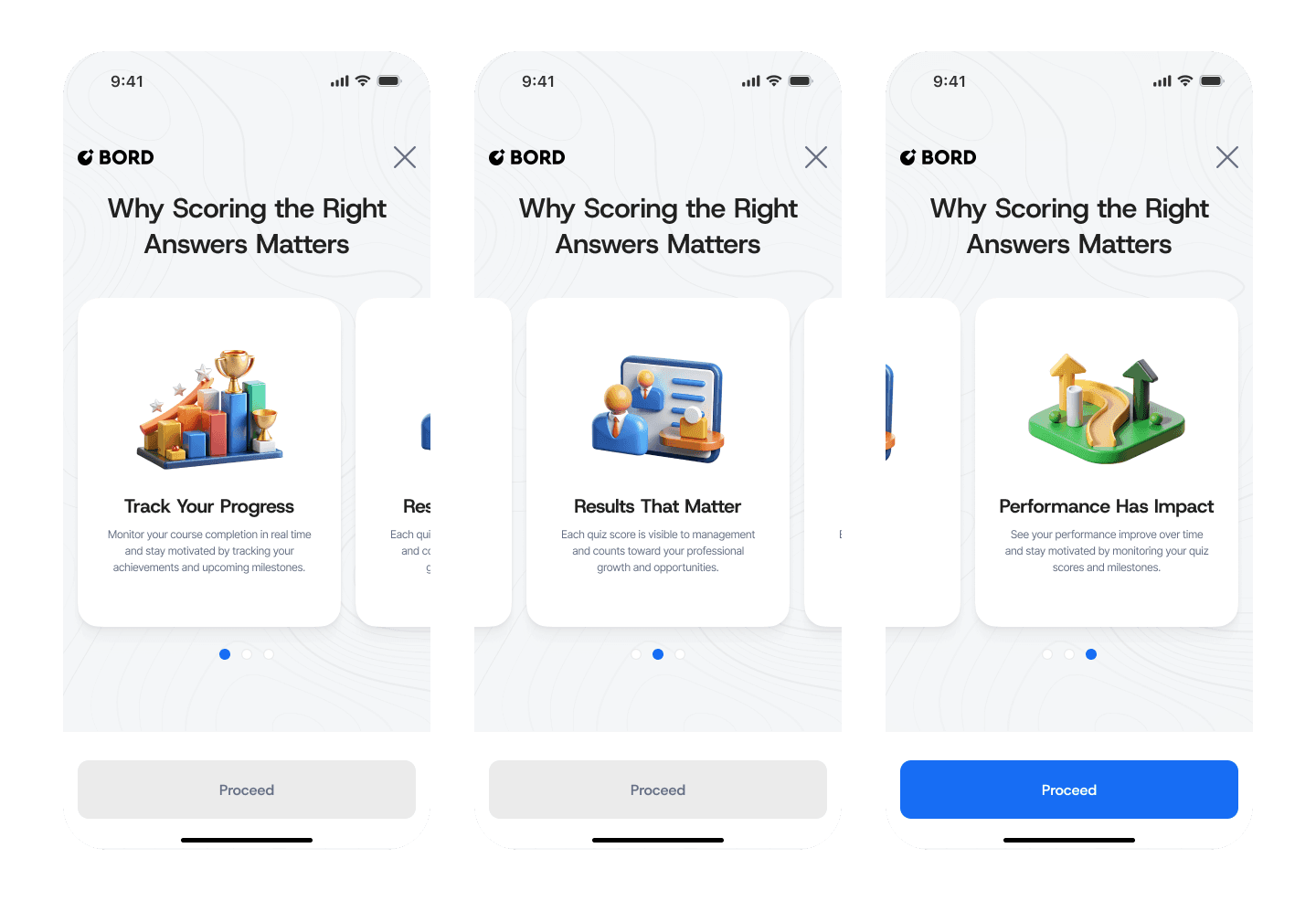
First-time onboarding
We designed the learner experience as a measurable loop: learn → check understanding → get feedback → continue. Progress rate appears across key screens so learners always know where they stand, and so completion feels achievable.
Quizzes are lightweight but structured. Users get immediate clarity on what they selected, then see results that reinforce motivation. For strong performance, the UI celebrates success with a clear score and confirmation. For weak performance, the experience avoids shame and focuses on improvement: “Keep practicing” plus a review mode that shows what was incorrect and what the correct answer was.
To improve comprehension and reduce confusion, first-time quiz onboarding explains why scoring matters—connecting personal improvement with real professional impact.
My contribution (what I owned)
Designed end-to-end admin workflows (course creation → structure → assessments → publish)
Created marketplace discovery + subscription flow (preview → summary → payment)
Designed subscriptions management for ongoing admin visibility and actions
Designed the learner journey across mobile (onboarding → progress → quizzes → results)
Established consistent patterns for empty states, CTAs, modals, and progressive disclosure
What I would improve next
Assignment flows: assigning courses to teams/users directly from marketplace and subscriptions
Analytics depth: cohort completion, drop-off points per lesson, quiz difficulty calibration
Content reuse: templates and cloning for faster course creation
Accessibility: improved contrast, keyboard navigation, screen reader labels for admin tables
Edge states: failed payments, empty results, incomplete course drafts, quiz retries